Brooklyn Brewery
Branding, Campaign
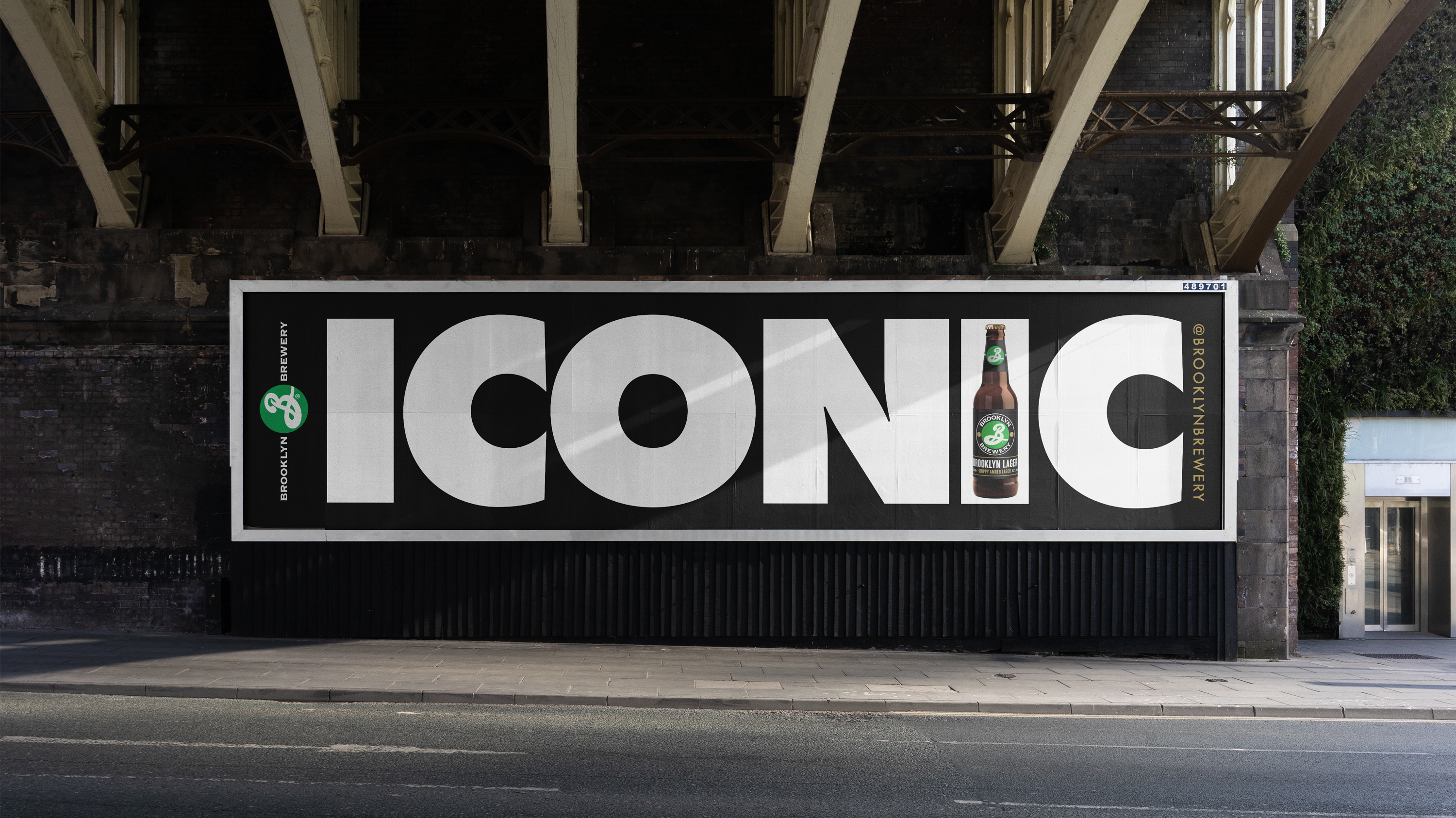
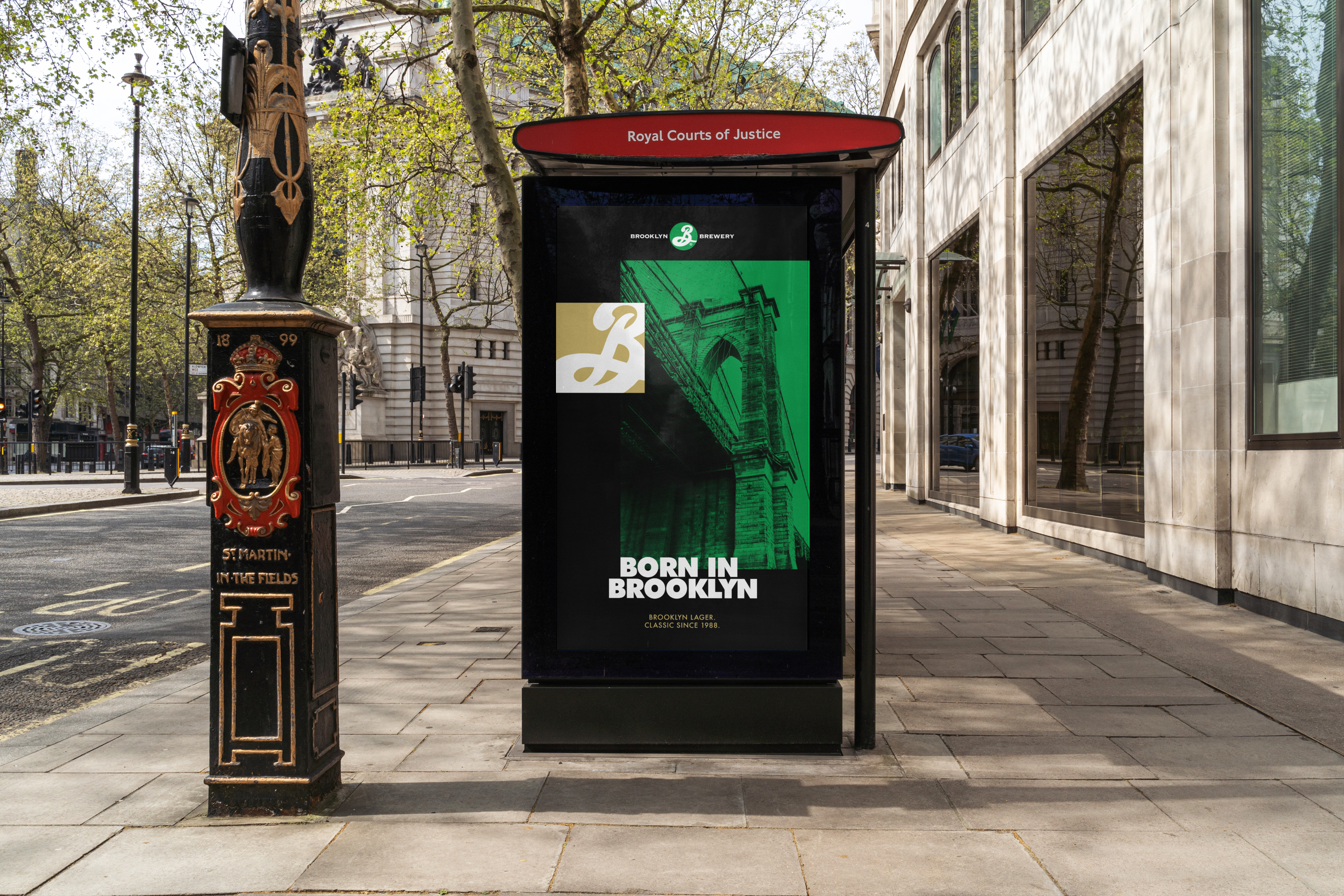
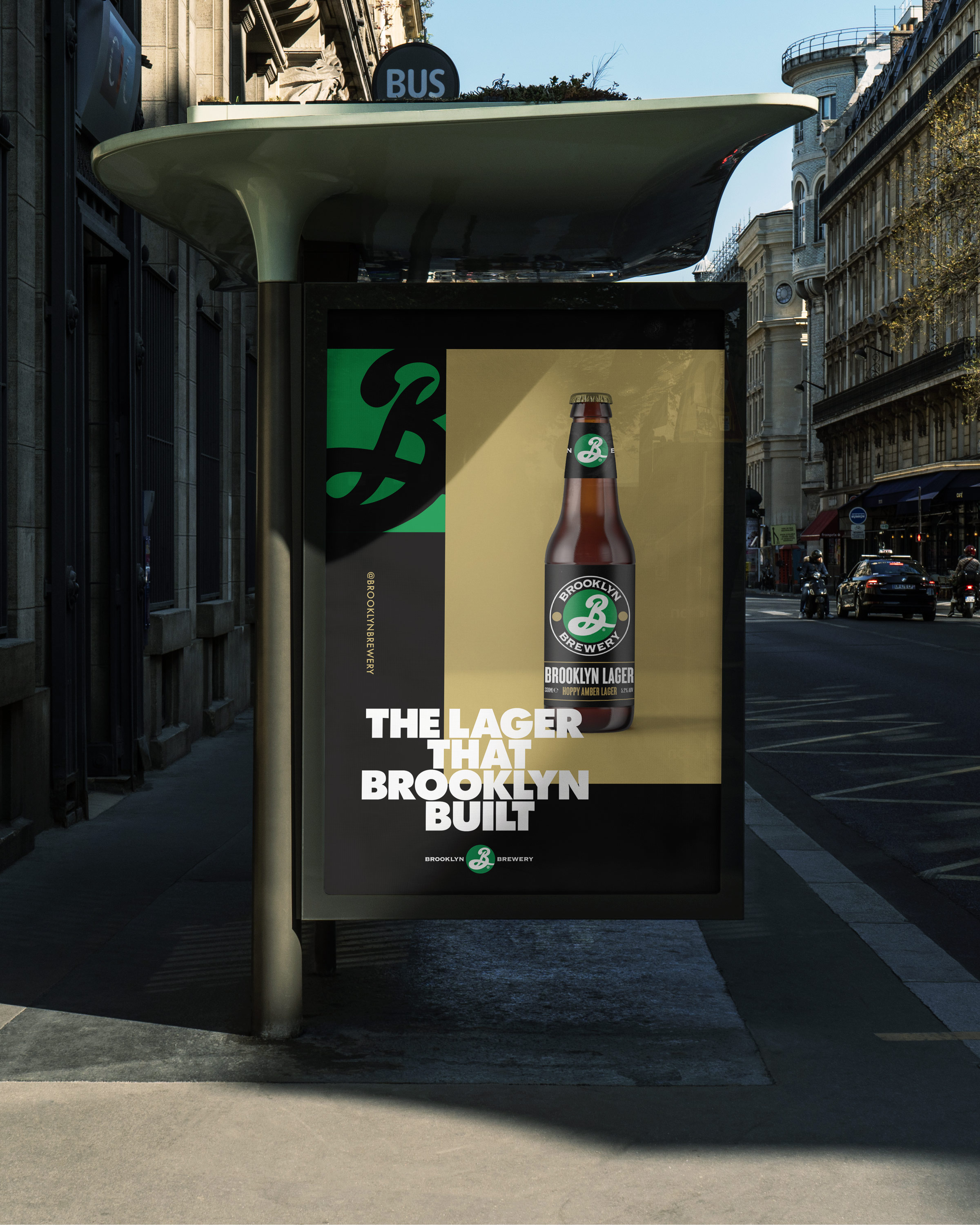
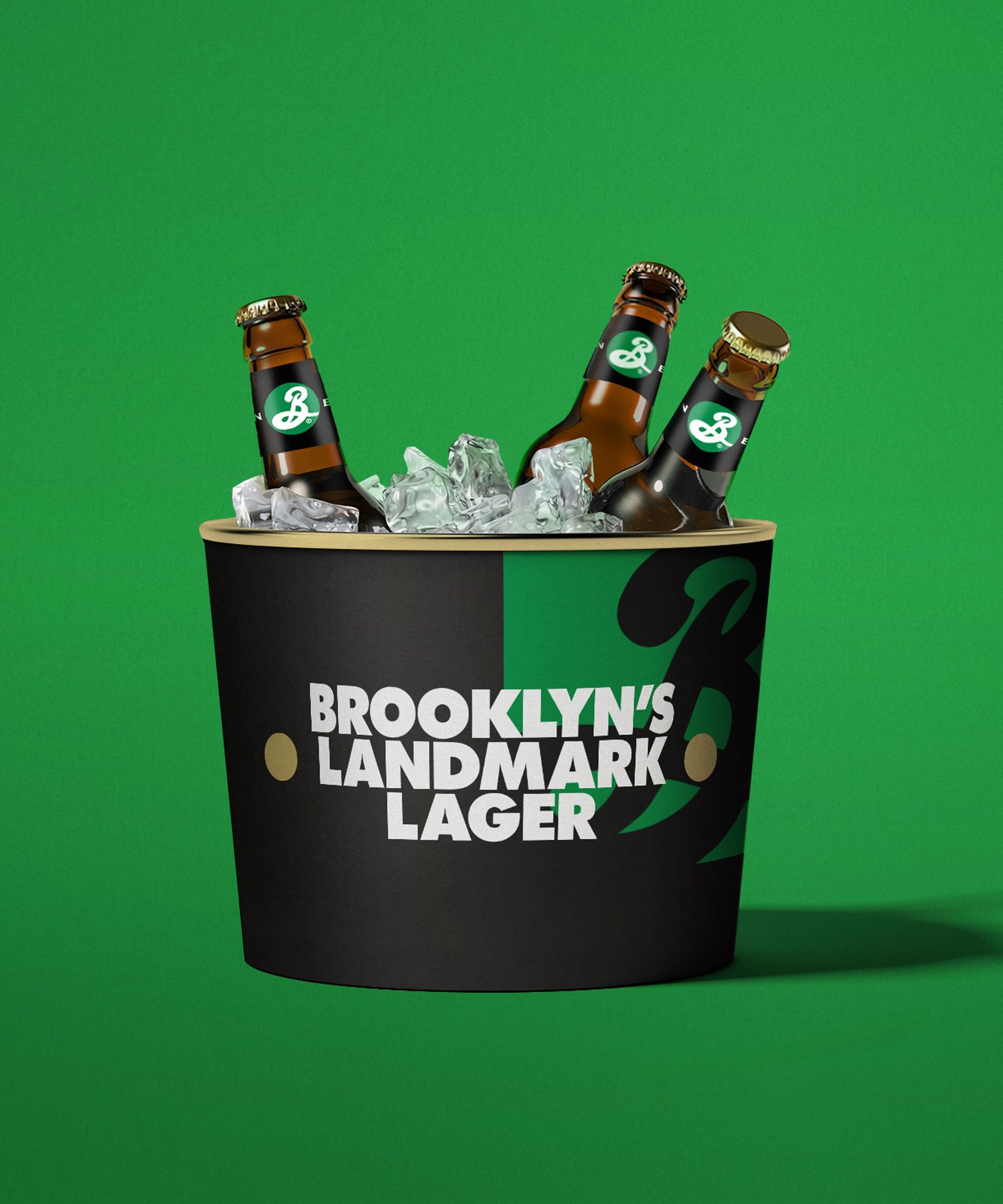
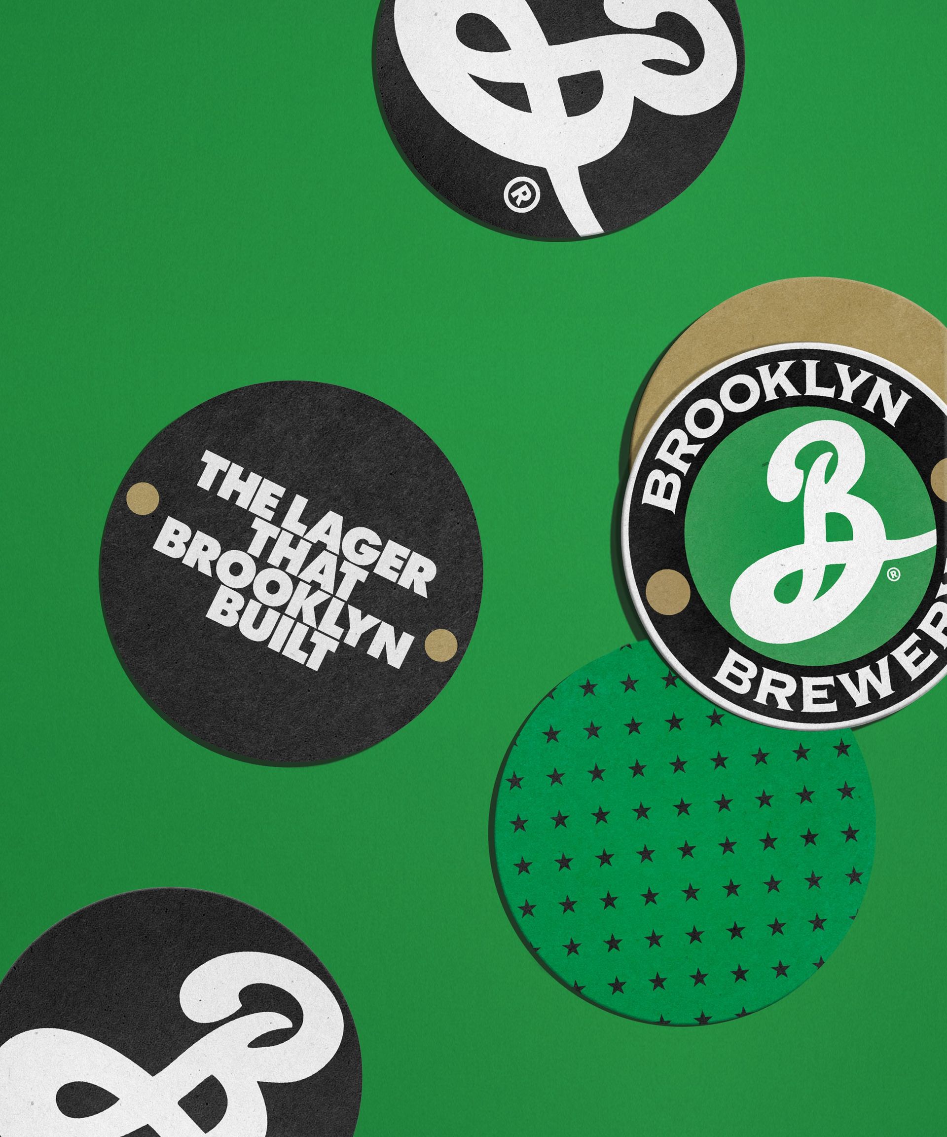
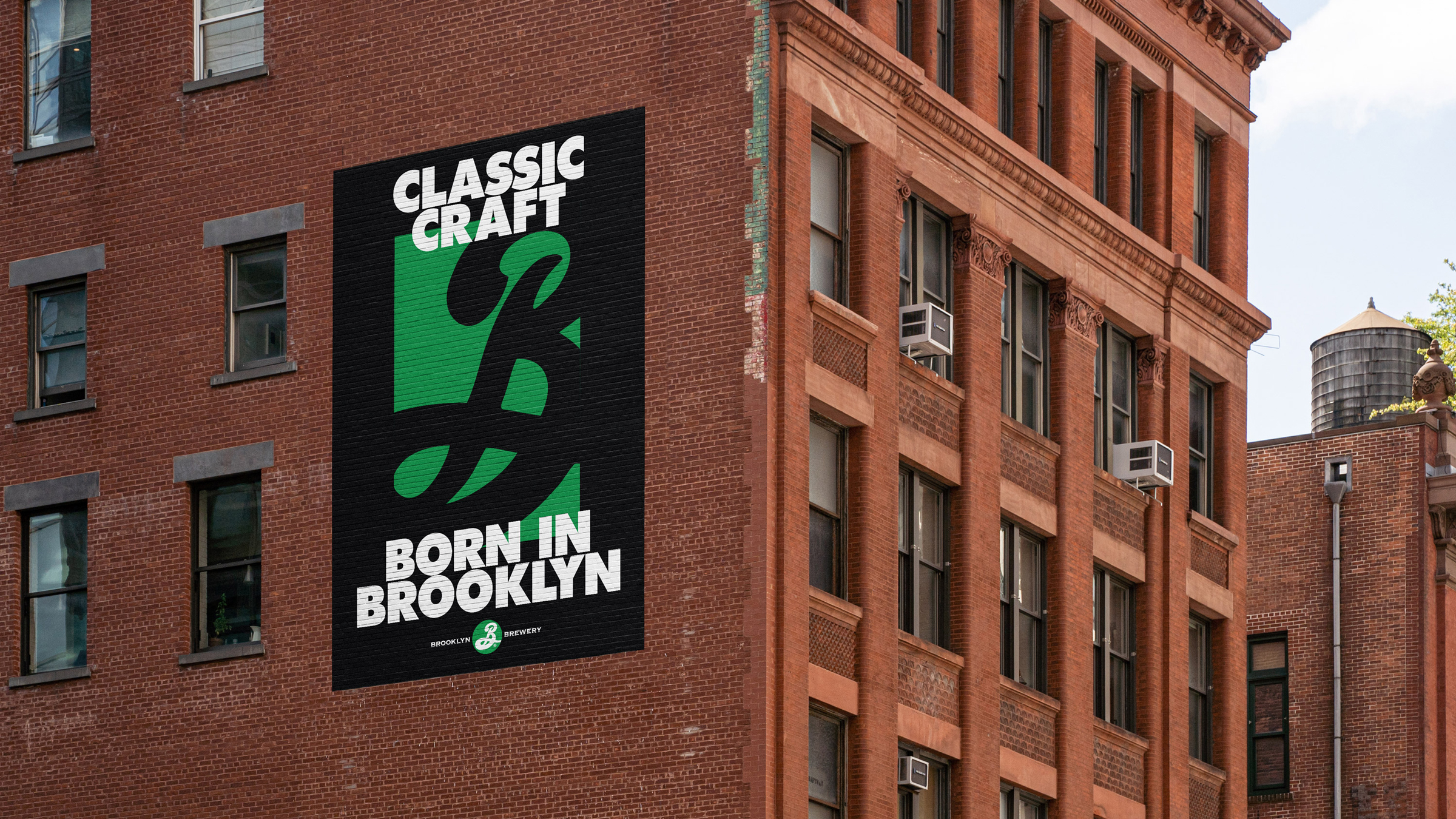
Born in our hometown in 1988, Brooklyn Brewery was not only a harbinger of the craft beer movement, but is also one of the most recognizable representatives of our borough on the international stage. Its distinctive flagship brew, Brooklyn Lager, helped the company rise to prominence, but was in danger of getting lost in the fray as craft goes commercial. Looking back to move forward, we were inspired by design legend Milton Glaser, the man responsible for the Brewery’s original branding. Aiming to revive the boldness of his work from back when the brand had nothing to lose, we fattened up the typography and paired it with simple, direct messaging that matched the unapologetic tone of the (stereo)typical Brooklynite. We repurposed graphic elements from the original packaging and elevated them to icon status.
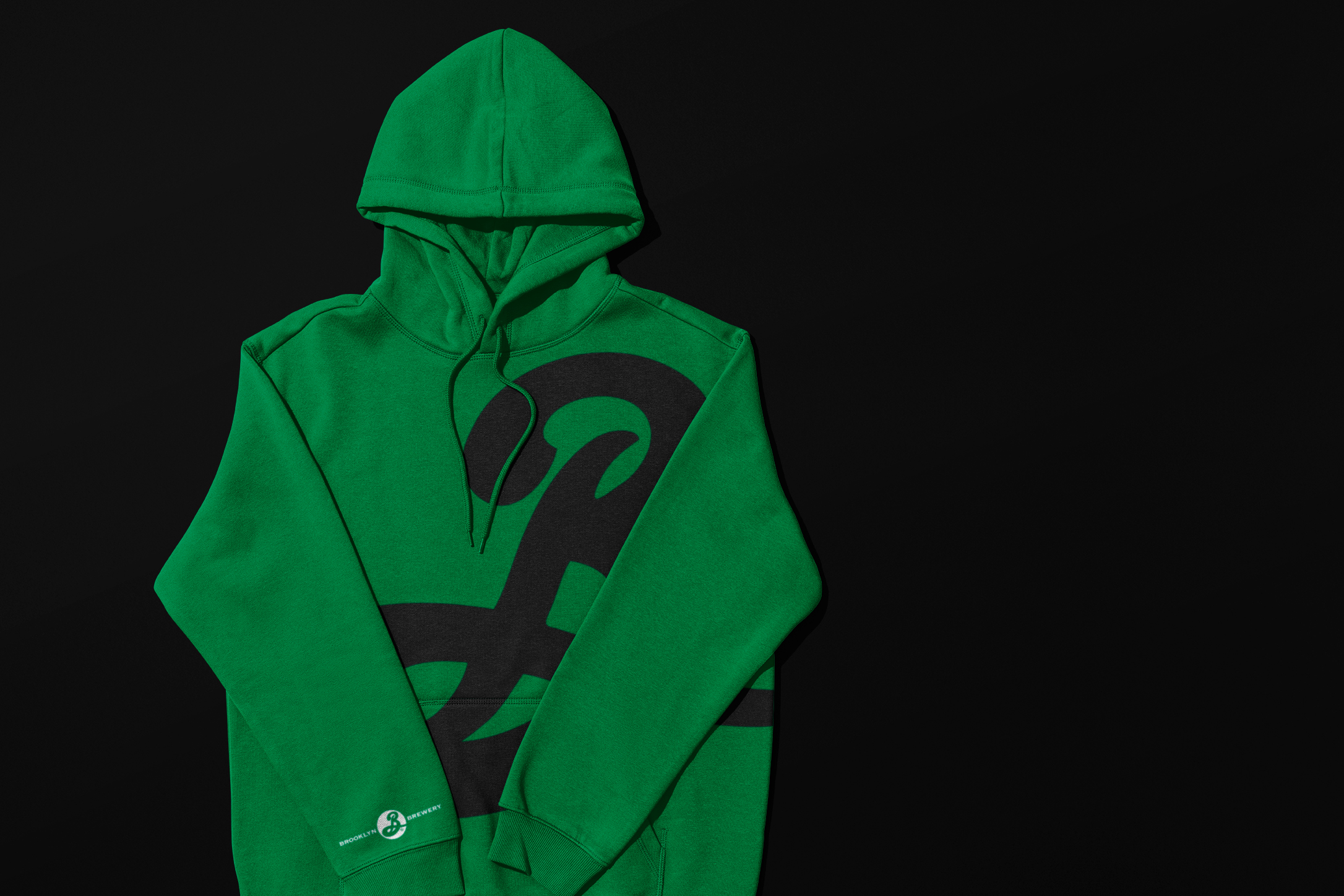
The new system was built to travel — across tap handles, markets, and time zones. A tiered set of assets gave the brand range: local enough for Bed-Stuy bodegas, bold enough for duty-free shelves in Tokyo. From insider winks to big, brash Brooklyn tropes, the brand could flex as needed without losing the thread.
–
Designed at Franklyn
Creative Direction: Michael Freimuth, Scott Cress
Design: Gabriel Rebes, Nana Nozaki